Typesetting APL
Vector 6:2, page 140
Transcribed from the printed issue; not yet reviewed. Read it in the PDF of the issue, page 140
While the rest of you were living it up in New York, your VECTOR editor has been quietly beavering away at the task of coding up a decent PostScript font for APL. Obviously I want to use this in VECTOR as soon as I can, so I thought a good start would be to print a complete list of the characters and invite comments:
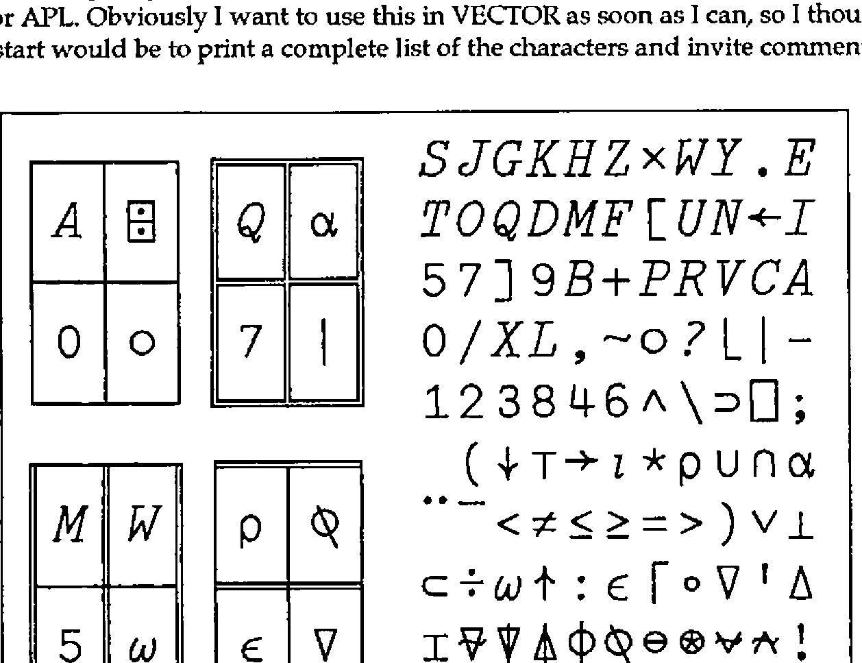
This is set at 30pt (before reduction from A4 to A5) and was printed on my LQ-500 dot-matrix with GoScript (as were the rest of these two pages). Of course you can in principle set the APL as big as you like:
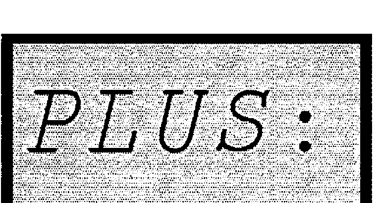
… but the font isn’t really designed to be blown up quite to this size! To be technical about it, it uses stroked rather than filled characters. These are much easier to handle (for the PostScript novice) and give quite a fair impression of the 2741-golfball original as long as you don’t look too closely! Just for interest, here are the definitions of ⍺ and ⍵ as used in the above font:
/ALPHA
 { newpath 1 setlinecap 1 setlinejoin
   40 setlinewidth
   504 448 moveto
   508 280 420 20 280 20 curveto
   56 20 56 448 280 448 curveto
   450 450 490 -240 574 130 curveto
   stroke
 } def

/OMEGA
 { newpath 1 setlinecap 1 setlinejoin
   40 setlinewidth
   200 450 moveto
   -100 0 220 -170 340 300 curveto
   220 -170 640 0 530 450 curveto
   stroke
 } def
Once you get the hang of Bezier Curves, you need astonishingly little code to define even quite complex shapes. Of course I prototyped my PostScript in APL, and quite a lot of the ‘boilerplate’ in the above definition was generated automatically.
The things I would most appreciate comment on:
- how closely should I stick to the 2741 original? I have tried to ensure that overstrikes really are true compound characters, but you will notice that this leads to a slightly asymmetric ⍉, and that the stile only just penetrates the top of the delta in ⍋. I have made ⍳ a little more curly than standard, and have reshaped the leg of the R. Also I cheated on ⍝ which is not quite a true overstrike.
- the lower-case letters. The IPSA font (see page 89) seems to me to be totally inappropriate; I have tried for something much more like IBM’s font as used in the APL2 Reference Manual … basically Courier-Oblique sized to match the APL caps. Comments please!
My target is to run the January 1990 issue on an HP Deskjet+ using GoScript. Incidentally, this text is set in Palatino, rather than the standard Times-Roman. Did you notice the difference?!