Comments on the APL2741 Typeface
Vector 6:4, page 116
Transcribed from the printed issue; not yet reviewed. Read it in the PDF of the issue, page 116
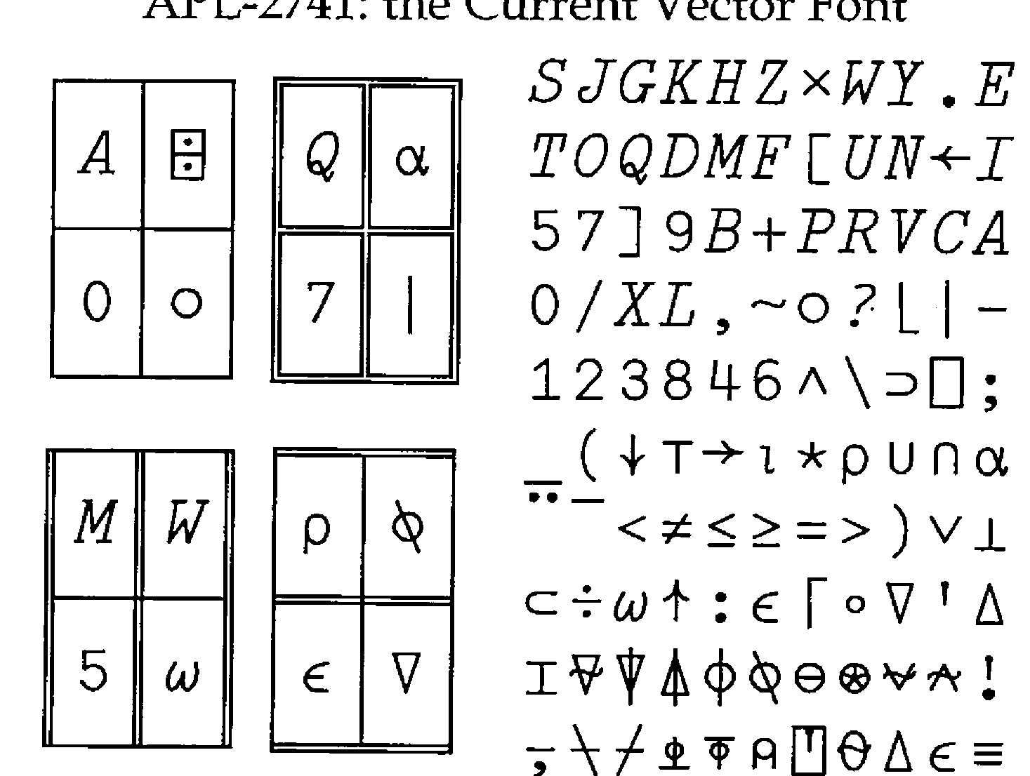
Thanks to Adin Falkoff for the following comments: "The serifs are too large on a number of upper-case characters, especially the bottom of the F, the verticals on the E, the horizontals on H and W, and the tops of P and E; the upper slant on the K breaks too sharply where it meets the slant leg; the curl at the bottom of the J should have a slightly more bulbous end; the right half of the squiggle on the Q is too angular, as is the flourish on the bottom of the ⍺; the top of the ∊ is perhaps a little flattened, or the bar is too high; and the slant of the numeral 1 should have a slight concavity, similar to the arrow heads, which are good. The special APL characters are generally good; my only quibble there is that the ⎕ is a little narrow for its height." Will be fixed for 7.1! Keep ’em coming … Ed.